Quantcast
Channel: ABCDEFridays
Viewing all 170 articles
Browse latest View live

Drop Caps

$
0
0
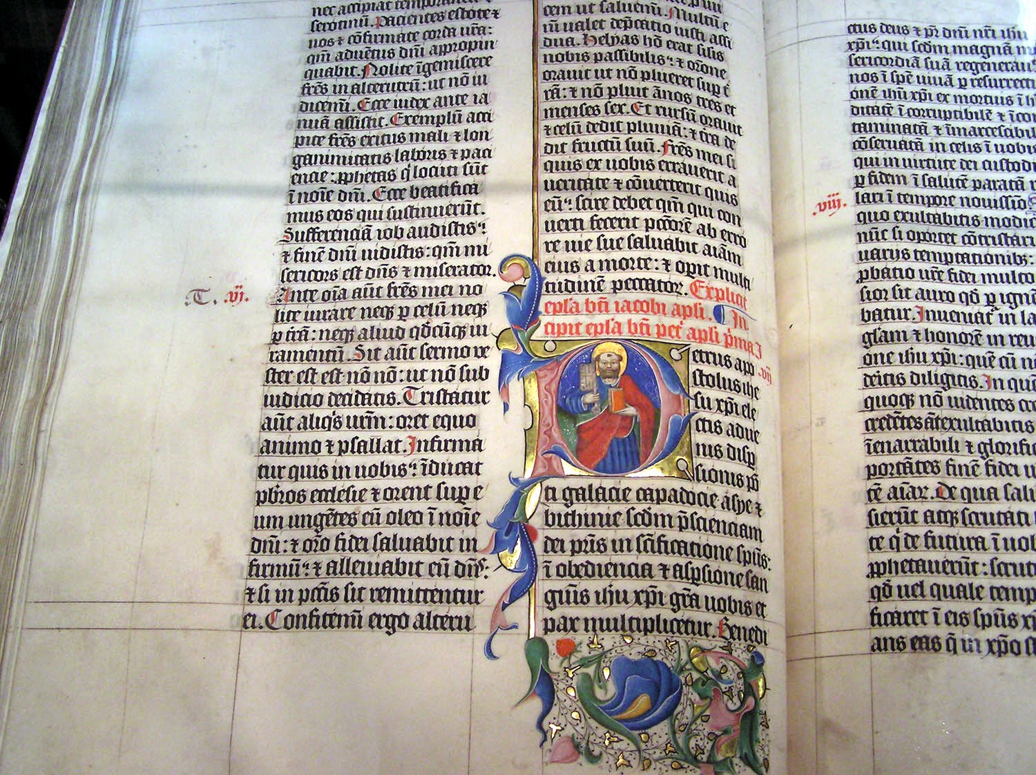
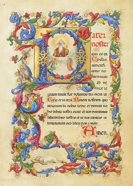
Drop caps or "initial caps" have been used dating back to the 4th century CE. Originally, they were not used as decorative elements. Scribes used them to mark where a new section started in the text, much like an indent in the beginning of a paragraph functions today. In the 15th century monks and scribes used drop caps as a way to start a new idea in a passage. "Historiated" drop caps were drop caps that contained an image in them to relate the image to the text. They also marked specific places in the text. In the image below you can see how the initial cap "P" in the word "Petrus" contains an image of Saint Peter, an example of an "historiated" drop cap. Initial caps like these were often in illuminated manuscripts.


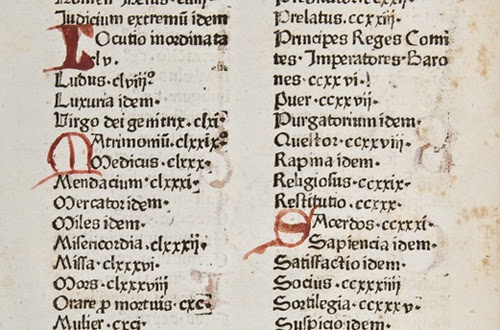
Drop caps were also used in books during these times. In the example below, drop caps are being used to order information alphabetically in a table of contents in a book. The initial caps were written in after the book had already been printed. Although not as beautiful as those in the illuminated manuscript, they still serve an important purpose.


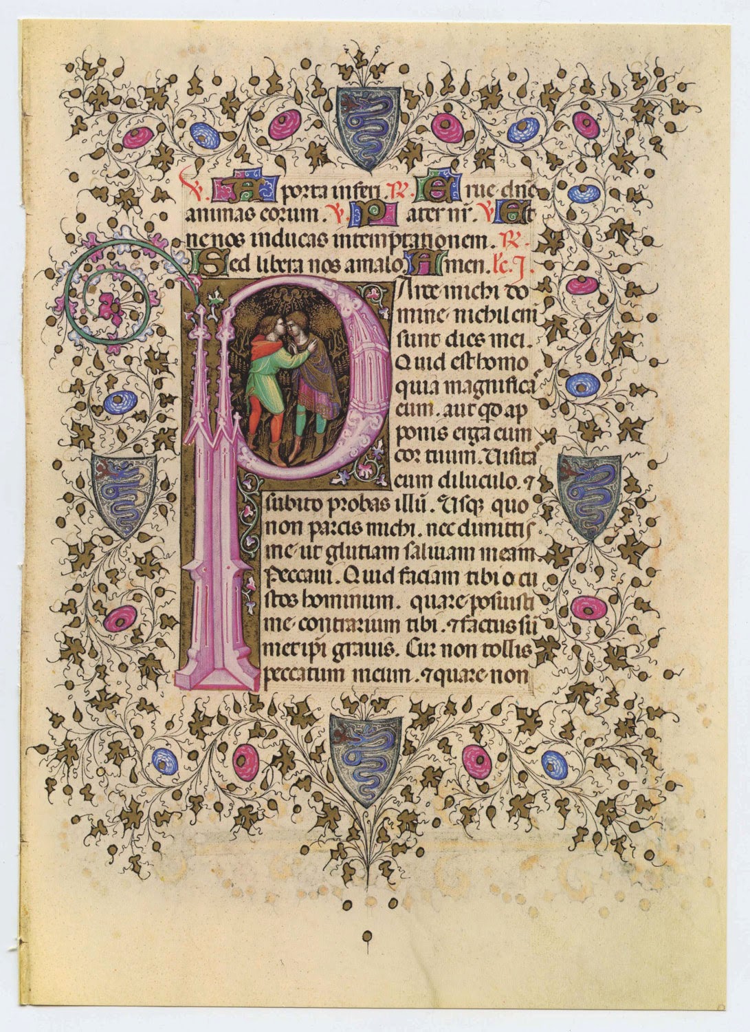
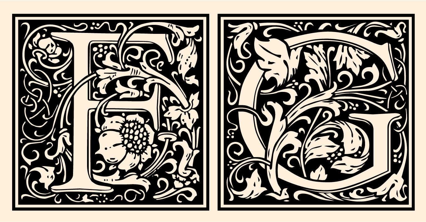
Early printed books often strived to replicate illuminated manuscripts. Space was left after the book was printed so an artisan could illustrate an initial cap and borders. An example of this is seen below.


Today, drop caps are no longer necessary and are typically used as a decorative element. They are often associated with an "old" or "traditional" feeling as they had been used so often in older texts.


Designer Jessica Hische has created a project called Daily Drop Cap, in which she created a drop cap for every letter of the alphabet, for twelve entire alphabets. The drop caps are done in a number of different themes and different illustrative styles.


Source: http://www.smashingmagazine.com/2012/04/03/drop-caps-historical-use-and-current-best-practices/


Drop Caps

$
0
0
Drop caps are larger letters that usually take up two to three lines of text. These letters can be ornamented or left simple, but can greatly influence the tone of the text. Often associated with children's storybooks, they can easily lend a whimsical look to the pages, but can just as easily give a modern feel.


The tradition of these ornamental letters begins during the middle ages, with the advent of the illuminated manuscript. These dense, illustrated, hand done volumes struggled for legibility and ornamented initial caps served as paragraph markers that allowed the viewer to scan for the paragraph that he or she wanted to read. For example, when reading the Bible, one might be searching for the Sermon on the Mount, and that passage would be marked with a larger letter, with an illustration of Christ surrounded by people, preaching. But most were not lavishly illustrated, and merely served a utilitarian purpose of drawing the eye to divisions within the text.


With the advent of the printing press, hybrid manuscripts started to appear, where the main body text left a gap for an artisan to come in and illustrate only the drop caps. They began to serve less of a utilitarian purpose, and became a status symbol and a luxury item.


Currently, drop caps no longer serve a utilitarian purpose, but are a purely aesthetic decision made by the designer to communicate ideas. They can be set type, illustrated or hand done.


Notably, Jess Hische did a large series of initial caps that push the boundaries of lettering. These can be examined in more detail on her website: http://www.dailydropcap.com


Drop caps can be placed in InDesign as part of creating paragraph styles. The program can take letters from the beginning of a paragraph, or can substitute an image or illustration for the initial letter.

Helpful links and tutorials:
https://www.youtube.com/watch?v=ct2t5KquDh0
http://helpx.adobe.com/indesign/using/drop-caps-nested-styles.html

Jamie Alloy - Photo Type

$
0
0
 Amandine Alessandra is a London based photographer who's work is mixed with design and typography. I find her type very beautiful and intriguing. I came across Amandine's work while researching type done with light paintings which is when the camera has an extra long exposure and captures the movement of light. This is a well known modern way to create. Amandine Alessandra uses the camera to do something similar but she captures the movement of hands (which are the brightest thing in her photograph so it is captured very well). This piece of her work I found the most interesting but she also creates type with a faster shutter speed in different ways shown below. The body is her main source of creating photographic type. 
https://vimeo.com/100358256http://www.amandinealessandra.com/index.php?/project/book-as-block-block-as-type/

Punctuation.

$
0
0
Punctuation!
Punctuation.
Punctuation?


If words are the meat of a language, then punctuation is the bones and nerves. Without punctuation, language begins to mesh together and refuse to make sense. Commas are the difference between inviting your grandma to eat and eating your grandmother (“Let’s eat, Grandma.” “Let’s eat Grandma.”) Periods, commas, and quotation marks are some of the most common of punctuation marks, but there are many marks that often go unused, though their purpose is equally as valid.

Ampersand:
Logogram originating as a ligature of the Latin “et”, meaning “and”.
Asterism:
Three adjacent asterisks, used to indicate minor breaks in text.

Dagger:
The original mark for the divide symbol. Used to indicate a footnote, after an asterisk has been used.
Number Sign (Pound Sign, hash, Octothorpe)
Various uses in Computer Science, musical notation, and a new popularity in social media.
Section Sign (Hurricane):
Used when referring to a specific section in a document, usually in legal contexts.

Fleuron:
One of the oldest marks, used in Greek and Latin Texts to divide paragraphs. Can be used to fill the first line indent. Were Phased out with the introduction of line breaks. Also used for borders.

Index (fist)
A small, pointing hand. Fell out of favor due to being a difficult mark to handwrite, though it was once used as an attention calling bullet-point.

Interrobang:
A ligature of the exclamation point and the question mark. More commonly written without the ligature, as “?!”.

Irony Punctuation:
A backwards question mark. Unfortunately this mark is often unused.

Lozenge:
A printers mark, often used for prodders and patterns.

Guillemets:
What the French and various other countries use instead of quotation marks.

Pilcrow:
The Paragraph mark. Used in text to indent separate paragraph or to make the beginning of a new paragraph in a large block of text.

Paul Reis

$
0
0
One of  my favorite graffiti font styles, Brooklyn was developed by graphic designer Paul Reis, who describes it online as 'a calligraphy-based typeface that is both sleek and brutal'. Created as a result of his calligraphic exercises and doodles, Brooklyn is available in two versions, regular and inline.


Typography Apps

$
0
0
We are all attached at the hip to our phones so as designers we should want to know what some of the best and most fun apps for our phones are. The app world is full of ways to improve your type skills and make type even more of your life then it already is. Most of these apps are just for IPhone/IPad because I have an IPhone and was able to test these ones out.


What the Font - free
This app lets you take pictures of fonts in every day life and shows you similar fonts and finds the font that you are looking for. It is not the most reliable but it works if the background is not to busy and the text is legible.


FontBook - 3.99
Fontbook is a resource for researching and comparing typefaces and fonts. It looks very extensive it has hundreds of examples. I didn’t download this app because I couldn’t afford to buy all these apps but this app had great reviews.


The Font Game - .99
The font game was created by Justin Stahl. It is a game where you have to guess what font is being shown there are 30 fonts and once you master those you move on to type terminology. I had a good time playing it trying to improve my score.


Helvetica vs Arial - free
This game is really simple you look at the word or sentence in front of you and say if it is either Helvetica or Arial. The more you get right the higher your score you get 3 lives. And was fun to play.


Kern - free
Kern is a game that teaches kerning. A random word with a missing letter appears at different point sizes. As the leading begins to shrink, you move the missing letter to its proper space. Your score is calculated based on the size of the type, the leading height, and the perfection of placement. It's a lot of fun and a great way to brush up on your skills. I thought this game was a little confusing but it was still interesting to play.


The Typography Manual - 3.99
This is a typeface and font resource that has a lot of helpful information including details on type anatomy, a glossary of type terminology, Mac and HTML key combos, an Em calculator, and a font-size ruler. I found it to be really helpful and worth the money.


Ampergram - free
This app was created by Philip Pastore. It lets you create endless typographic compositions using photos of fonts. You can also take your own photos and upload them yourself. And then you can save these text images to your phone and share them with your friends


OverGram - free

Over is the full version but it does cost money. This app Over is the perfect choice for any Instagram addict, enabling you to add typography to your images quickly and easily. I thought it was fun and had a lot of choices its not a learning app but still fun.

Road Signs, an Unnoticed Art Form

$
0
0

Although highly unnoticed, street signs are all part of the vast majority of design when driving or walking down the street. From big to small. and wide to tall, street signs are an everyday convenience that  make our lives a hell of a lot easier and go highly unnoticed. There simplistic use of typography and vectorized marks are a way to get the message across to the viewer as fast and easy as possible as well as help people navigate their everyday life.

There are many different typefaces used around the world for different street signs. Helvetica is used to navigate around New York city subway systems, where as Helvetica Neue is used for road signs in Hong Kong. Clarendon is the face used in our US National Park systems. Each face is used in a particular way to serve a specific function, readability. Some road signs used grid-based typefaces, some were extremely wide geometric typefaces with the simpler forms of a and g, some very thin, and some very heavy (Ralph Herman}." Part of the reasons these faces work so well is because of their unique style in being able to read them without hesitation. Although sometimes designed very poorly. These signs are created to be scene and read quick and easy so people can glance at them quickly and go on there way. They are designed to be read up close and from football fields away.  


With the flux of automobiles on the road and the rise of industrialization beginning in the 1920’s, adaptations had to be made to keep people safe and to be able to navigate while driving. Simplistic and minimalistic street signs and road markers were the answer. The rise of type faces and the idea of readability and clarity was a heightened point in design.  Swiss designers became obsessed with this idea of clean but elegant design. The design of the signs were sometimes very decorative with a decorative serif set on it but as time went by the design of these became more simplistic due to mass production. 


Antique Street signs seemed very peculiar and interesting because of the history and look of these signs. It seemed that the typeface would be pressed into some kind of metal or aluminum and the painted. I have always been fascinated with antiques and antique signs and lettering because of that antique quality. Signs were usually hand painted back in the day in which gave them so much more personality and style. Today signs are usually just set type on material mass-produced. Although the type-face on these signs may be elegant and clean the aesthetic quality is just not how signs used to be.


Digital Distribution of Fonts and The Typographer Behind It all

$
0
0
Today it seems like by the click of a button we can download and use fonts, but ever wonder how it all started? There was one revolutionary that started it all. Erik Spiekermann Co-founded Font Shop with his wife Joan Spiekermann where they became the first digital distributor of Fonts. In 1989 Joan and Erik Spiekermann signed contracts with leading type foundries and stored hundreds of fonts on floppy disks. The way people ordered these fonts were to call and order them they would send out the font on the floppy disks through the mail. 

Soon after the launch of the original vendor of digital type he teamed up with that other famous graphic designer, Neville Brody, and founded FontFont, which has since then become the largest independent foundry of original type designs. Not only does it produce some contemporary classics, but it also houses wildly imaginative designs, and spearheaded many innovations in digital type technology. His distribution of type on floppy disks soon became obsolete and FontShop moved their company to the Web and distributes fonts online.

Erik Spiekermann has created 475 typefaces to this day and all of them are readily available for purchase on FontShop.com and he continues to make more work to this day. Some of the typefaces that he created are Berliner Grotesk, FF Meta, ITC Officina Sans, and FiraSans.
.

He was founder of MetaDesign in 1979, Germany’s largest design firm with offices in Berlin, London and San Francisco. He is responsible for corporate design programs for Audi, Skoda, Volkswagen, Lexus, Heidelberg Printing, Bosch and way-finding projects like Berlin Transit, Düsseldorf Airport and many others.


http://vimeo.com/19429698 - Putting the Face back into typeface

Window Typography

$
0
0

I've always loved hand lettering. This week I decided to look into typography that can be found on windows. Mostly these illustrated (or set type) letters can be found in shop windows. Some of these letters are vinyl cut while others are directly written on the windows with markers. There are shops online where you can custom order you vinyl letters, but others may like the more hand done approach. There are special pens and markers which write on glass such as chalk markers which give a bold and appealing look. There is a video here about a workshop held called "tempting typography" which shows the process of hand lettering on windows and how beautiful the end result can be.

Tempting Typography

 http://media-cache-ak0.pinimg.com/736x/84/93/b3/8493b33b989cf3be603d706529abd12a.jpg

http://media-cache-ec0.pinimg.com/736x/54/e1/a2/54e1a2bab47bd3ea8cd5a5dd41cc5157.jpghttp://media-cache-ec0.pinimg.com/736x/13/d6/05/13d605535fa4337abe822d467f1e773d.jpg

http://www.nicework.co.za/nice-blog/wp-content/uploads/2013/01/1861f912ffc62062bdeaf9a94c145d44.jpg

http://kphotoblog.com/wp-content/uploads/2012/11/toronto_typography_photography.jpg


https://c2.staticflickr.com/8/7384/8814959497_22067196d3_z.jpg


http://media-cache-ak0.pinimg.com/236x/0d/5c/b4/0d5cb4732ec1add227966a8038c8f95c.jpghttp://25.media.tumblr.com/tumblr_lt3642c9ZO1qln2e2o1_500.jpg

shop window in amsterdam - if we decide to go the lettering/ornament only route w/ no image, we could do something like this. If it still is too simple, it can be embellished even more w/ layered type, etc.


Philadelphia Mural Arts Program & Typography's Role

$
0
0
Out of the hundreds of community arts projects across the country, it is difficult to find one more recognizable and widespread than Philadelphia's Mural Arts Program. A city whose buildings, neighborhoods, and citizens are incredibly different from one another, Philadelphia is a place where it is necessary that a common ground be present for its inhabitants. The work produced by the Mural Arts Project certainly provides that and so much more. From animals and nature to history and religion, the topics that these murals focus on are intended to bring people and their communities together once and for all.

It is no question that the larger-than-life pieces of artwork depicted on walls of buildings across the city of Philadelphia are pleasing to the average eye. However, although several of the murals are driven by singular artists who create them for recognition or fame, a majority of the wall paintings have much to do with community-based volunteer work. For example, Jane Golden, a driving force behind The Mural Arts Program and an expert in revolutionary urban art, came up with an idea several years ago to introduce the organization to troubled youths with poor upbringings and even worse reputations. These young men, most of which had come from deprived childhoods, were channeling their misfortune through public vandalism and graffiti. Golden, seeing the good in all, took a risk and reached out to the boys, hoping to capture their attention. She tried to persuade them into making the leap from illegal action to beneficial doings by turning their urge to make graffiti art into a desire for mural art. The young men’s participation in the program would also act as community service. Knowledge of this turned the offer into one they simply could not refuse. As months went by, the mural arts gained large amounts of popularity, giving each individual project even more meaning and continuing to help Philadelphia's citizens and visitors of all ages.


--

While many of the murals produced through the Philadelphia Mural Arts Program rely heavily on pictorals to get their point across, it can easily be argued that type is the most important factor. Just like anything in the art world, images without words or captions are generally intended to be left open for interpretation. However, the Mural Arts Program is more than just an opportunity to display abstract art. Each piece has one or several specific messages attached to it, and it is crucial that these messages are easily read by anybody and everybody who views them. That being said, it's great to see murals that produce a hybrid of both pictures and words with such beauty and cohesiveness. It is even often that, in these works of large-scale art, the picture is the word (like in the first image). Pieces such as these may be considered even more successful than others, for they cover both type and image in the matter of a single glance.


Now that the importance of typography's role in the Philadelphia Mural Arts Program has been explained, it must also be stated that typeface and font do, indeed, matter here. Just like a publication as physically miniscule as a newspaper article, the purpose of these gigantic murals is to be read. In addition, nobody wants passerbys crashing into each other in attempts to decipher a word or phrase on the side of a building. Therefore, the copy must be very easily legible. Unique and pretty to look at, sure—but understandability comes first. This means serifs and sans serifs that are the perfect size, weight, color, et cetera; and tracked an appropriate, thus readable amount. Upon first glance, all of the murals you see in the City of Philadelphia may not seem to have taken typography into such consideration, but that's because they represent it so flawlessly. It would be absurd to not put thought into the manner in which words are presented to the community, visually. After all, words are the way we communicate and help one another as citizens and as human beings—very fitting when considering The Mural Arts Program's true purpose.


--


--

To hear more from founder Jane Golden, find out where all of the murals are located throughout Philadelphia, and more: http://www.muralarts.org/

Chalkboard Type

$
0
0
Chalkboard type is becoming a very popular way to design and apply type. Dana Tanamachi is among the most famous for doing this, but we are seeing more and more designers start doing this.

At the Columbus College of Art and Design, two college students have been breaking into their school and anonymously creating type on their chalkboards. They go by the name "Dangerdust", and create a weekly artwork. They are both seniors in the Graphic Design department, and remain passionate about their art, even on top of their course-load. They even used one of Jess Hische's quotes and her for inspiration for one of their pieces:


We even see it here at Tyler! At the Hatchery, the new store opening up in the lobby.


Typography Side Projects

$
0
0
A side project is a piece of work that a designer self-initiates and is not hired to create by a client. Side projects vary in every way as they are typically utilized by a designer to explore in depth a personal interest. Side projects are a great avenue for exploring new or unfamiliar techniques without the pressure of a deadline (for the most part) or the requirement to fulfill a client's needs.

Besides being enjoyable and a learning experience, side projects also provide an opportunity for a designer to showcase their skills. A designer may be hired by a client to do work very similar to his or her side project. With side projects it seems as though designers have a public outlet for personal work. It is also turning out to be a great way in which a designer can market his or herself for the kind of work they want to do, be it more illustration or hand done lettering.

Friends of Type


40 Days of Dating


Nicholas Felton's Annual Reports


Alphatecture

$
0
0
I found Alphatecture interesting because usually typography involves building forms and molding shapes to create the letter forms. However, with Alphatecture it is all about using what is already in your surroundings to find the forms in something that was not meant to resemble a letter. Peter Defty is well known for his execution in this process. He is a professional photographer based near Leeds, in the UK. He takes photos all around the world and creates different alphabets based on each city he has been to.
Google Maps Typography uses the same idea but approaches it a little differently by using an aerial view to find letters in natural land/ building formations. This particular alphabet was put together by Rhett Dashwood, he did it over the course of several months. Its a little hard to read, but it shows lots of creativity and persistence.


http://rhettdashwood.com/16575/Google-Maps-Typography 

http://www.pinterest.com/murathocaoglu/alphatecture/ 

Typography Around the World

$
0
0
Typography can be defined as the art or process of printing with type. However, it is not just about type on a page. It can be representational of a vast variety of subjects, and even emotions.


All over the world, people have been using typography as a way to “brand” their country. It becomes part of their National Identity. A nation’s branding is a way of creating individuality, and reinforcing their culture and imagery. National branding can also be a way to advertise their country’s positive attributes (such as WWI & WWII propaganda), or used as a way to organize the country itself (such as how England branding the Underground, or the use of Helvetica for street signs). There is even a ranking of the top 25 Country Brands, at futurebrand.com. From Germany to Japan, typography is an integral part in how a country represents itself. These representations can be shown through street signs, advertisements, storefronts, products, post cards, and more.


But how do countries form typographic styles?
In a typeface, the specific letters refer to the verbal characteristics of that certain language. These characteristics of the verbal language can also affect the actual appearance of those letters. Since every country has it’s own unique language, it makes sense that they would have their own way of writing this language, and their own style of expressing the letters. Typography therefore becomes an important role in a nation’s brand; it expresses a country’s language and personality as well. Typography is almost more important than imagery and color for a country, because it is specifically linked to the people of that country on a deep level.


Arabic calligraphy is a great example of how typography can be so vastly different. There are multiple styles of Arabic calligraphy. Some are just linear styles, where others are made into unique art forms. Animals, fruits, and decorative elements are the most prominent. This form of calligraphy is very prominent in Arabic culture, and is thus a huge factor in their cultural branding.


Germany on the other hand uses calligraphy in a completely different way, and has actually been a factor of a turbulent time in Germany’s history. Antiqua, a roman type style, gained favor in Catholic regions of Europe, while Protestants in northern Europe favored the Germanic Gothic typestyle, Fraktur. Most often Antiqua was used for scientific and learned works and Fraktur was for literary works. However, many authors would favor a certain font, and there were a few debates on which font should be used more. Hundreds of years later the Nazi party used blackletter as a representation of Germany in their propaganda posters.


In Britain, typefaces were designed for utilitarian purposes and have become a huge proponent to their national brand. The London Underground was started in 1913, and used Johnston Sans for the signage. Imperialist expansion was growing, and Edward Johnston, the creator of Johnston Sans, used his typeface as a backlash against German design. When finished, the successful branding of the London Underground was a reassurance to the English that the British Empire would survive the war.


From these three examples, we can see how influential typography is to not only a nation’s branding, but to a nation’s history as well. Type embodies both the physical and mental notions of certain time periods.


Lettering vs Calligraphy

$
0
0
Despite the frequently ill-defined line between Lettering and Calligraphy, they have always been separate disciplines. Lettering vs Calligraphy, a new project from Berliners Martina Flor and Giuseppe Salerno, seeks to bring together both the craft of drawing letters and the art of writing, but at the same time emphasize and celebrate their differences.
Their initiative is an online visual dialogue between a letterer (Flor) and a calligrapher (Salerno). They simultaneously draw/write a letter daily in response to a keyword supplied by a moderator. Visitor to the site are invited to vote for their favorites, and guest specialists (moderators) are invited to select the letter that, in their opinion, is the best.


http://www.letteringvscalligraphy.com


Graffiti

$
0
0

Graffiti, like any other form of art, has its own history. The word can be traced back to the Roman Empire and translates loosely into "writing on the wall". It was until the 20th century, around the 70's, where modern day graffiti started to take form. It evolved to getting bigger and more artistic. The size started to increase as the creators started to out-do one another. The bigger the name was, the more bragging rights you had and the more important it became. There was almost an unspoken competition between the artists. 

I use the term artists because they are, in fact, artists. Graffiti is highly under appreciated and over-looked due to the fact that it is illegal and usually located in places that are run-down. In actuality, it takes tons of practice in order to make it look good. A lot more thought is put into it than we think. It's not just some kid walking up and spray-painting a wall. It also isn't easy since it's not as if they can practice it willingly; they have to dodge cops and property owners. If caught, they face large fines or even jail time. 

Unfortunately, the name "Graffiti" gets a bad feeling from it since it is associated with illegally defacing public property, even though there are some really incredible works of art that fall under the category. The work can actually be poetic and beautiful since there can be a lot of emotion, depending on the time/mood it was created. There is always a debate over whether something is real "Graffiti", or an artistic work created by a professional artist. 

Are legal murals graffiti, or does it have to be illegal and unpaid? Typically this depends on a persons view towards graffiti. In most countries, however, artwork labeled as graffiti is usually illegal. 

Good or Bad Graffiti?


Graffiti work done by TheZork

Speed Art, Graffiti Alphabet Video:
https://www.youtube.com/watch?v=bB4jOOff8dQ

http://thezork.deviantart.com/art/melted-boi-graffiti-269041433


GRAFFITI IN DESIGN 


"This Is Not Graffiti"


Article 0

$
0
0
Legend David A. Smith & A Brief History of Glass Signs


David A. Smith is famous in the sign-writing world. He started in 1984 and apprenticed for 5 years with renowned traditional sign painters, basically learning how to master the art without with out any preliminary sketches. In 1992 He opened up his own shop in England, doing everything from vehicle graphics to 3D installations. His precision and perfection always set his work apart from the rest. He spent the next few years working with sign painters, carvers, muralists, and gold leaf experts. Eventually this led to his dominance in the reverse glass world.
(more work to follow the history)

Reverse painting has been an art form since ancient times, there is no accurate dating to its begin. By the 13th century, reverse glass signs appeared in Italy, then France and England. It became common in many parts of Europe during the renaissance as well. These painting were primarily related to religious decoration most often at church alters.


In the early 1800’s reverse glass was very popularly used to decorate mirrors or clocks. The practice has come and gone briefly. Today, it holds a special aesthetic that many strive to achieve in small businesses of great quality. In the case of David Smith, he collaborate with big companies and artists who share appreciation for the historical practice.

http://davidadriansmith.com (watch video on Jameson collaboration)

Here is a couple shots of the "glory days" of sign painting practice:


Here are some detail shots as well as process shots from his studio in England:


http://davidadriansmith.com (show video credits starting at 16:40)
-
The End.


Article 2

Graphology

$
0
0
Graphology is the analysis of the physical characteristics and patterns of handwriting purporting to be able to identify the writer, indicating psychological state at the time of writing, or evaluating personality characteristics. Its a pseudoscience, or a process falsely represented as scientific. Many people assume that graphology must be legitimate because it has occasionally been accepted in court. Graphologists believe such details can reveal as much about a person as astrology, palm readingor the Meyers-Briggs personality type indicator. However, there is no evidence that the unconscious mind is a reservoir of truth about a person, much less that graphology provides a gateway to that reservoir.
Real handwriting experts are known as forensic document examiners, not as graphologists. They detect authenticity and forgery.

Graphology uses at least 300 different handwriting features in its investigative approach.

-Slants
(left slant indicates emotion and reserve, right slant indicates a response to communication, no slant indicates independence)

-Size
(Large writing indicates an outgoing nature, small writing indicates the opposite)

-Pressure
(Heavy pressure indicates commitment, light pressure indicates sensitivity to environment and empathy, uneven pressure indicates a lack of vitality)

-Word Spacing
(Narrow spaces between words indicate a wish to be with others, but such writers may also crowd people and be intrusive)

-Line Spacing
(Wide-spaced lines of handwriting show a wish to stand back and take a long view.Closely spaced lines indicates that that the writer operates close to the action. For writers who do this and who have writing that is rather loose in structure, the discipline of having to keep cool under pressure brings out the best in them.)

-Margins
(If the writer has a wide left margin, the interest is in moving on. If it is narrow, caution and wanting to avoid being pushed before they are ready is indicated. Narrow right margin shows impatience and eagerness to get out there and on with things.Wide right margin shows that there may be some fear of the unknown.)

-Other areas of analyzation include the shape of round and sharp letters, the tendencies of dotting i's and crossing t's, Capitals vs Lowercase, the angle of curves, etc.


Serial Killer's Handwriting Analysis
characteristics of serial killers handwriting:
  • vigilant and tense handwriting
  • extremely strong pressure
  • angles
  • arcades
  • separation
  • narrowness
  • extremely wide spaces between words or identical to the spaces between letters
  • covering strokes
  • emphasized upper zone
  • left of upright slant
  • frozen
  • tense strokes
  • high upper zone
  • large or extreme height differentials
  • at times - a weak stroke
  • secondary narrowness
  • angular connections
  • similar to the "autistic type" by odem
  • rhythmic writing
  • covering the whole page
  • strange ending of letters
  • "invented" letters
  • twisted letters
  • broken letters
  • corrections, especially "artistic corrections"
  • abundance of punctuation marks or lack of them
  • slow writing
  • peculiarities and exaggeration
  • printed letters


William Heirens
murdered 3 women, one 6 years old


Ted Bundy
raped and murdered over 30 women


Jeffery Dahmer
murdered 17 people


Zodiac Killer
Murdered 5 people


Roy Norris
raped and murdered 6 young girls


3D typography

$
0
0
Three dementional type is really cool and really interesting to me as a designer. I enjoy the tactile quality of the form because it also has a function. The textures of the objects used to create the type is inspired by the topic. For example, using toast to say toasted. The bread had been toasted and to create the scene the photographer also put jam or jelly in the composition. Or baked cookies made with dough and baked.


http://theinspirationgrid.com/creative-typography-by-six-five-studio/

3D-Printed Type Sculptures by Ben Johnston & Mark Simmons

Toronto-based creative duo Ben Johnston & Mark Simmons used their complementary skills to create these amazing 3D-printed typographic sculptures.
The beautiful pieces were created to explore the transition between 2D and 3D space through combining two design disciplines – graphic design and product design.
The quality of these are great. They are done so well with the design formed in a lock up. And can be held which interacts with the viewer instead on a 2-d surface.


Viewing all 170 articles
Browse latest View live